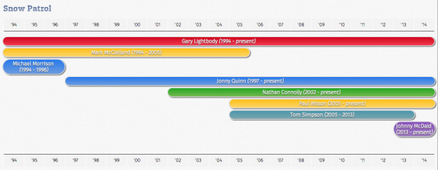
Finally settled on something to write for my first post. So here it is – a timeline chart made with pure CSS and JavaScript. The actual timeline chart is viewable on the working demo page itself. The code is available at my GitHub repo. Here I’m detailing my thought process, logic for what I’ve done.
This is in essence an update/refresh of a timeline chart I made back in 2010 as part of one of my assignments for my Web Technologies module at the University of Bristol (the original is viewable here. Mach 2, if you’d like. After 2+ years working as a Front End Web Developer, I decided it’s time to see how it can be improved on now that I have more experience working with CSS, HTML and especially JavaScript under my belt.
One improvement is that I have now put all the band data into a JSON file that is parsed using JavaScript (I’d do it in vanilla JS, but some things are just much easier and less verbose code wise with jQuery, e.g. selecting an element by ID). When I first did this, the data was all held in the HTML itself.
The widths, positions of the timeline chart’s bars in the original were entirely made up of hardcoded values in the CSS. This time the widths, positions are calculated dynamically with JavaScript using the data held in the JSON file. The main advantage of doing it this way is that only the JSON file needs to be updated and the JS makes sure the timeline keeps itself up-to-date with each changing year (i.e. no need to update this next year just to add an extra year to the years/y-axis). I also wouldn’t have to keep (re)calculating the widths or positions as the years progress if I intended to maintain it to keep it up to date. I’ve also tried to write the JS code to be reusable if/when I decide to add another JSON file(s) for another band(s). Unfortunately, since there is no way to put the style values in the CSS itself (well, not that I’m aware of…feel fee to correct me as I’m always learning) the style attributes for the individual timeline bars’ width and position had to be generated as inline styles. To be honest, I think the use of inline styles is more of an issue had this been an XHTML page as opposed to a HTML page.
Now the one disadvantage of the changes I’ve implemented is that if for some reason JavaScript is unavailable on the browser, e.g. corporate security policy or a text-based browser like Lynx, the user isn’t going to be able to see any data rendered. With the data all being held in the HTML itself, this wouldn’t be an issue. So this needs to be taken into consideration when building something like this where pretty much everything is pushed to JavaScript land. That said, CSS-wise, as the timeline’s x-axis and each individual band member are laid out as unordered list elements, with CSS disabled you’d still see the details nicely laid out aside from the timeline’s x-axis being repeated (which I did for aesthetic reasons).
In terms of skill progression, when I first made this, I wasn’t very familiar with JavaScript or JSON yet plus one of the assignment requirements was that the web site I was building had to use valid HTML and CSS, no JavaScript. And as HTML5 and CSS3 were still new then, those weren’t allowed either and we were being taught to write XHTML pages. Restricting perhaps, but it was one of the intentional handicaps set by our Web Technologies, and I loved the challenge.
My aim here is to show what can be achieved with current (basic) front end web technologies, which these days is quite a lot. I’m just scratching the surface. I can see the next level for this would be to use SASS for CSS pre processing (Mach 3) and Backbone.js to build this with a MVC architecture in mind (Mach 4). BTW, I believe a timeline chart like this is possible with a data visualisation library like d3.js or highcharts.js (I’ve only recently started looking into those for work and for a personal project)…but then where’s the fun in that? 😉

